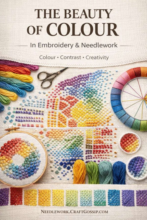
Colour is often the first thing that draws us to a piece of needlework. Before we notice the stitches, the fabric, or the hours of work involved, it’s the colour that stops us in our tracks. Whether it’s a softly faded antique sampler or a bold modern embroidery bursting with saturated threads, colour has the power to change how a piece feels, how it’s remembered, and how it lives in a space.
In needlework, colour isn’t just decoration. It’s emotion, balance, memory, and intention stitched together one shade at a time.
Why Colour Matters So Much in Embroidery and Needlework
Colour choices affect everything — from how complex a design appears to how calm or energetic it feels when finished. A simple motif stitched in muted tones can feel elegant and timeless, while the same design worked in high-contrast brights can feel playful and modern.
Many traditional samplers relied on a limited palette, often because thread availability was restricted or dyes were expensive. That restraint created harmony. Even today, some of the most striking needlework pieces use fewer colours than you’d expect, relying instead on subtle shifts in tone.
Understanding colour in needlework isn’t about rules. It’s about awareness.
The Emotional Language of Colour
Every colour carries an emotional weight, whether we consciously recognize it or not.
Soft blues and greens often create a sense of calm and order. Warm reds and golds can feel celebratory or powerful. Neutrals ground a design and give the eye a place to rest. When colours clash unintentionally, a piece can feel unsettled — even if the stitching itself is flawless.
This is why colour substitution matters. Changing thread colours isn’t just a practical decision; it’s a creative one. A single colour swap can completely shift the mood of a design.
Antique Needlework and the Beauty of Faded Colour
One of the most fascinating things about antique needlework is how colour changes over time. Reds soften, blues grey slightly, and linens mellow into warm ivory tones. While modern stitchers often chase colourfast perfection, those gentle shifts are part of what gives antique pieces their quiet beauty.
Faded colour tells a story. It reflects age, environment, and use — and reminds us that needlework was once part of daily life, not just decoration.
There’s something reassuring about that.
Modern Threads, Endless Possibilities
Today’s stitchers have access to an extraordinary range of threads and colours. From subtle hand-dyed flosses to bold contemporary palettes, the options are endless — sometimes overwhelming.
One helpful approach is to start with a single colour you love and build around it. Pull shades that naturally complement it rather than forcing contrast. Trust your eye. If the colours feel balanced when laid side by side, they’ll usually work well stitched together.
Sampling before committing is never wasted time.
Using Colour to Add Depth and Interest
Colour can create depth even in the simplest stitch patterns. Gradual shading, tonal variation, or repeating a colour in small accents throughout a piece helps unify the design.
It’s also worth remembering that background fabric plays a role. Linen colour, weave, and even natural slubs can affect how thread colours appear. A floss that looks bright on white may soften beautifully on oatmeal or antique ivory fabric.
Let Colour Be Personal
Perhaps the most important thing to remember is that colour is personal. Trends come and go, but your response to colour is uniquely yours. If a palette makes you pause, smile, or feel calmer just looking at it, that’s reason enough to use it.
Needlework has always been a quiet conversation between maker and materials. Colour is part of that dialogue — sometimes bold, sometimes subtle, always expressive.
Whether you stitch with the discipline of tradition or the freedom of experimentation, colour gives your work its voice.
And that, truly, is where the beauty lies.


Leave a Reply